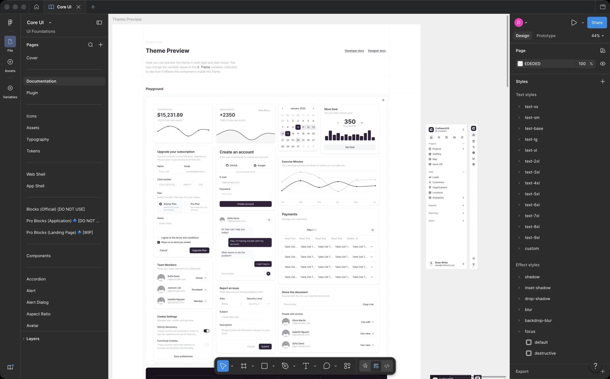
Component Library + Design System
The full design language behind every Craftwork surface: brand guidelines, HIG, tokens, primitives, and the bespoke component layer. Packaged as @craftwork/ui and consumed across Rails, Vite React, Next.js, and mobile, with Storybook in the same monorepo as the source of truth.
Context
Craftwork OS (Rails + Inertia at the time), the customer portal (Next.js), and the marketing site (Next.js) had drifted apart. Each used a different vocabulary of components. Some screens used shadcn defaults, others were hand-rolled CSS, and there were no shared tokens holding the brand together. The surfaces were starting to look like three different companies.
Challenge
Designing on top of shadcn meant keeping its primitives swappable while injecting Craftwork's visual language at the token and variant layer. Fork it and the upgrade path dies. The harder problems were adoption and reach: the system had to be more useful than reaching for an ad-hoc component, and it had to work for any consumer in the monorepo without the consumer needing to know which side of the codebase a component came from.
Decisions
- Started with the brand guidelines and HIG, written with the staff designer and CEO in a company-wide Notion doc as the canonical source for color, type, voice, motion, and the rules a component author can reach for before writing code.
- Evaluated prior systems and UI kits and landed on shadcn primitives for the full source ownership and zero abstraction layer between us and the components we ship.
- Rebuilt the token and variant layer in Craftwork's brand language on top of shadcn so the system upgrades with shadcn instead of forking away from it.
- Built a bespoke component layer for everything shadcn doesn't ship: calendars, kanbans, bento layouts, toasts, call and messaging UI. All sit on the same primitives so behavior stays consistent.
- Packaged the system as @craftwork/ui in the Turborepo monorepo so every consumer (Rails + Inertia, the new Vite React app, Next.js, and the Expo mobile app) imports from the same source. One change updates every surface.
- Made Storybook the canonical engineering source of truth and paired it with Figma component docs on the design side. Both sides reference the same names, variants, and usage notes, so design and engineering point at the same component in review.
Result
Engineers compose existing components instead of restyling, so new screens ship in days and every Craftwork surface reads as one product. shadcn upgrades land cleanly because the brand layer is isolated from the primitives underneath. Design reviews shifted from styling debates to behavior, because designers and engineers point at the same named component.